Twitter –> Markdown FTW!

Thanks to Jim Groom for sharing this post by Matthias Ott, my Twitter archive has now been converted from HTML to Markdown .

To do this, there is a Python script, created by Tim Hutton. As Matthias explains:

  • It converts the tweets in your archive to markdown with embedded images, videos and links.
  • It replaces t.co URLs with their original versions.
  • It copies used images to an output folder, to allow them to be moved to a new home.

I don’t know if I want to host my Twitter archive anywhere but having run the parser I know that it is now future-proof and far more portable, should I decide to host it publicly in the future. It is, after all, a significant part of my digital footprint from the last 13 years and nine months.

If you haven’t taken a copy of your Twitter archive yet, I recommend that you do. And if you do have a copy of your archive, it is definitely worth converting it into a more friendly format.

Now I just need to decide if I want to nuke my Twitter account completely? šŸ¤”

Responsive Part Two (Fine-Tuning)

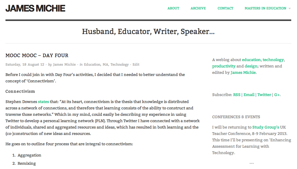
After updating my blog and home page to be more responsive, I continued with a little fine-tuning. Here is a brief account of the additional changes I have made…

Blog

Blog Home 01.09.12

Typography

  • I have added a Google font called ‘Bitter‘;
  • I edited the sidebar CSS to make the font size and colour more consistent with the blog body.

Functionality

The majority of tweaks that I have made are focussed on improving the way the blog functions…

  • I have switched back to featuring whole posts on the front page of the blog rather than excerpts;
  • The about pageĀ has been updated to include an accurate list of my most popular posts;
  • To make it easier for visitors to find specific content, I have added category links at the top of the archive page;
  • All internal links now open in the same window; only external links open in a new window;
  • As well as videos and images, embedded Google Docs now resize automatically. I achieved this by editing the Ā FitVids.jsĀ script within my blog’s theme. While it doesn’t specify this on the FitVids.jsĀ github page, it will work with both ‘docs.google.com’ and ‘drive.google.com’ documents embedded using the iframe tag.

Home Page

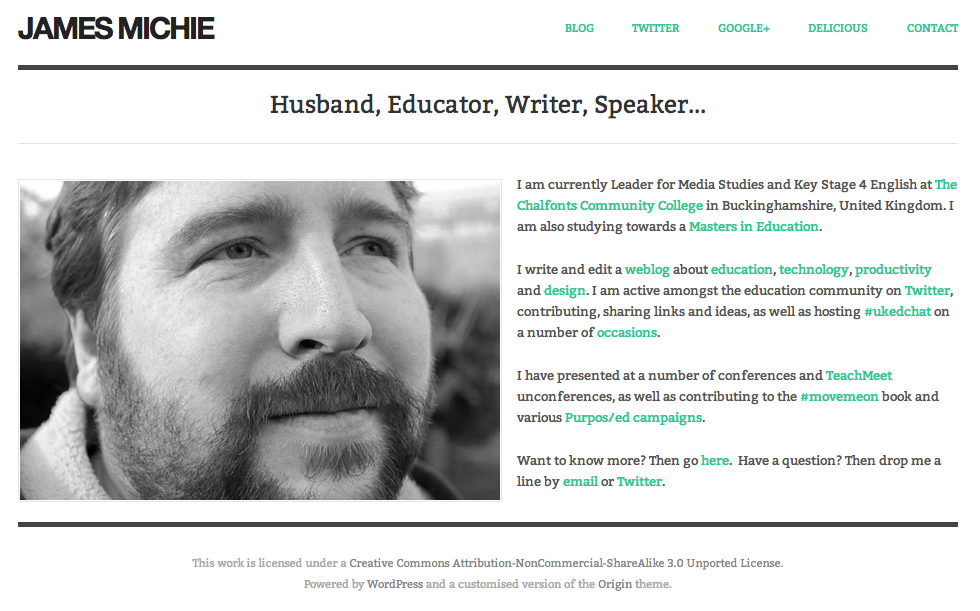
Improved Home

My home page now features a mini-profile with links to specific content, rather than a series of buttons. I think that it is more personal and does a better job of providing an overview of who I am, what I do, and where I can be found online.

I have also employed the built in menu to display direct links to key aspects of my online footprint, including my Twitter and Google+ profiles.

These changes have also improved the way the home page displays across all devices.

Responsive

The mobile web is in the ascendency, with many UI and UX designers, iterating for mobile before desktop. With this in mind I have been wrestling with CSS and HTML5 to make my blog more responsive to different screen sizes. However, I kept encountering a range of problems, trying to turn a basic WP theme into something far more up-to-date.

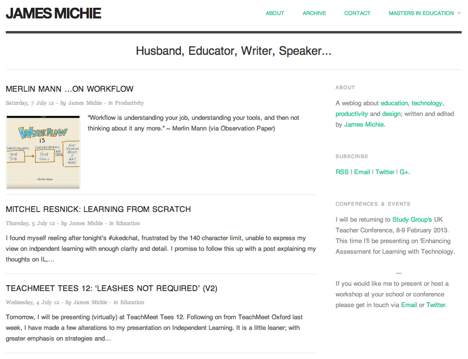
Instead I have installed theĀ OriginĀ theme, which is already set up to be responsive. Tinkering around with both the CSS and HTML, I have managed to construct a design that I am happy with. I coded a menu at the top and took the opportunity to install a new contact page. I also removed some features that I felt were peripheral, adding to the minimalistic style I favour.

Blog 15.07.12

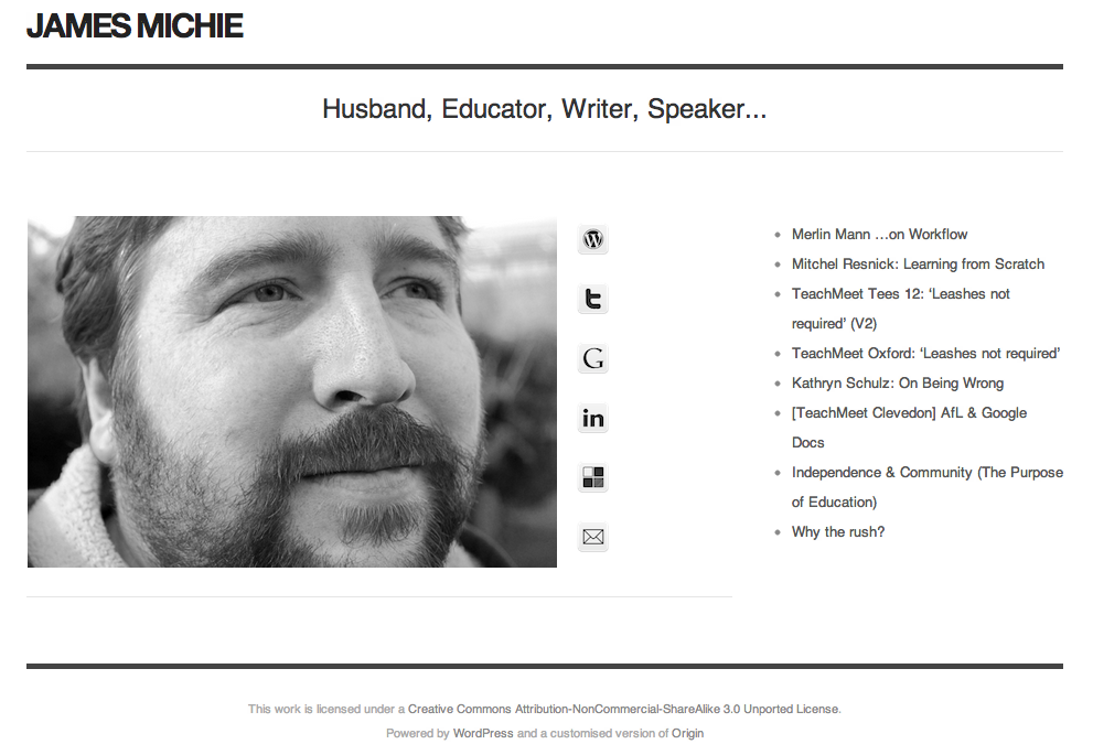
Sporting the same theme as my blog, myĀ home pageĀ is also more minimal, creating a more consistent experience for people who stumble across via search or through links on Twitter and Google+.

Home Page 15.07.12

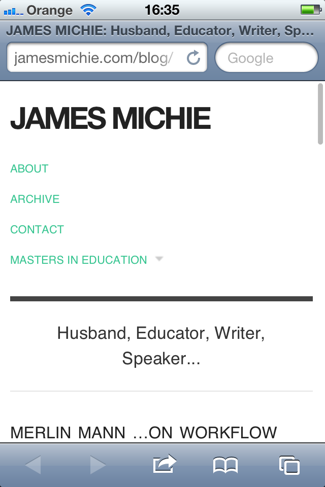
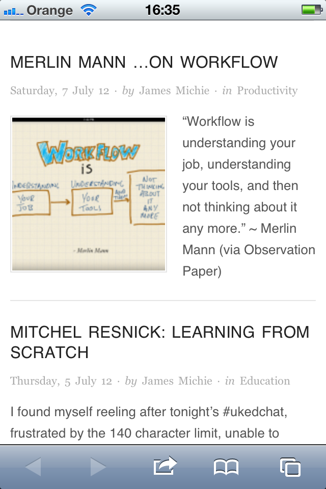
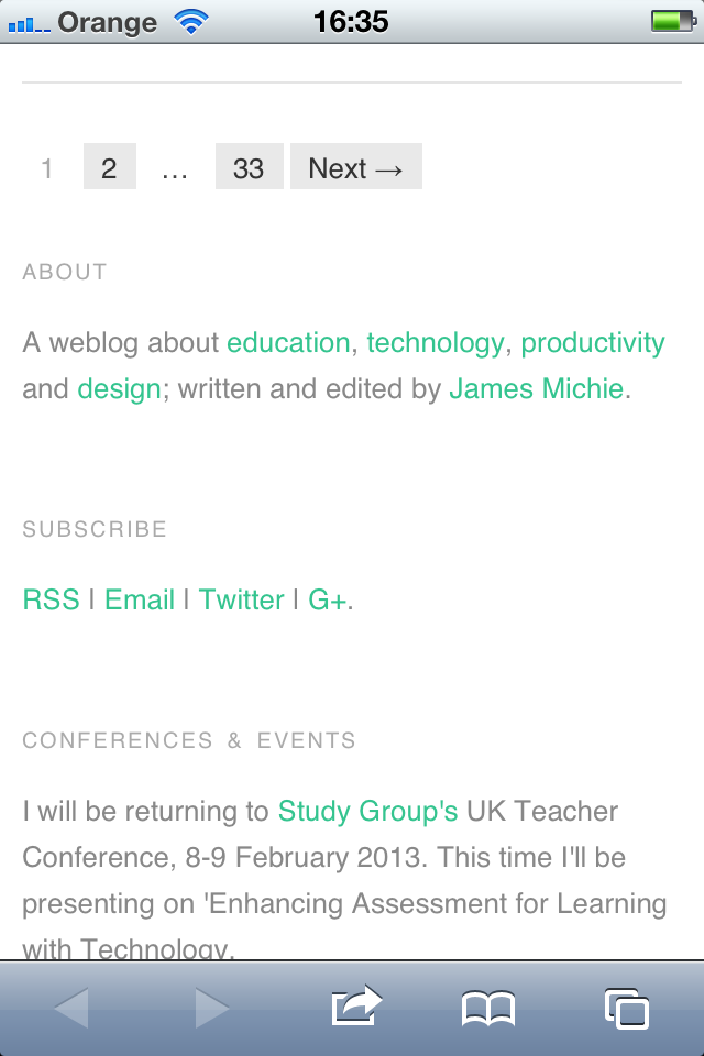
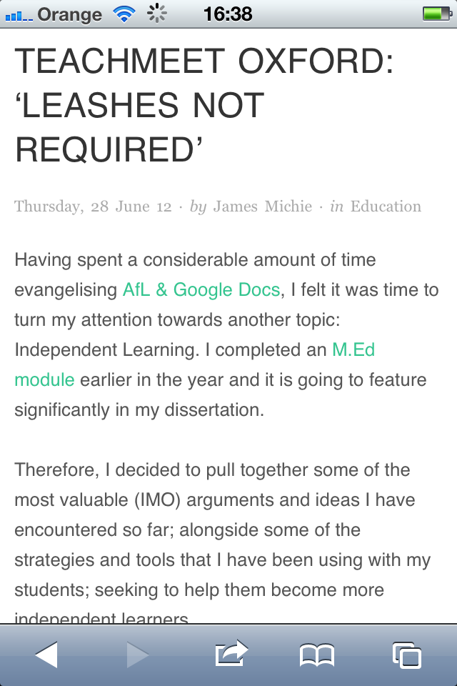
I am most pleased with the way my blog now renders on mobile devices. The menu drops below the header, while the text resizes naturally to fit. The sidebar becomes pinned to the bottom of the page below the posts, and the posts themselves maintain all of their formatting. Images and videos also adapt to suit whichever screen they are being viewed on. Moreover, the blog is HTML5 compliant ensuring that all content is viewable regardless of OS or browser.

Blog iPhone 1

Blog iPhone 2

Blog iPhone 3

Blog iPhone 5

Please let me know what you think, particularly if you are viewing this on your mobile device. Iā€™m interested to learn from othersā€™ experiences; aiming to make my blog as accessible and user friendly as possible.

Perfect ‘Simple’ Note Making – Revamped

nvALT, my preferred text editor, has been the constant tool in my writing and note making setup for more than a year now. There have, however, been a few changes to both the way I write blog posts and the way I create and sync notes with my Android phone. Therefore, I felt a brief update was in order.

Syntax

While learning HTML syntax has helped me to build and customise this blog, it is not particularly easy to use when writing blog posts. What I prefer, is to write in plain text. To avoid writing out lots of HTML, I would write posts in nvALT and then add links, formatting and images in the WordPress browser-based editor. This was not the worst workflow but it was not ideal.

Over the last three months I have been learning to write using Markdown. Markdown is both a software tool and a simple syntax, created by John Gruber, that allows you to maintain your focus on writing. It works by converting plain text, formatted with the Markdown syntax, in to valid HTML.

nvALT has Markdown support built in meaning that I can write a blog post using the syntax, quickly open up a HTML preview to check that everything looks as it should, then simply copy/paste the HTML source code directly into the WordPress browser-based editor. After adding a title and tags all I have to do is hit publish. A far more pleasing workflow.

If you are interested in learning Markdown quickly, this video by Eddie Smith is definitely worth watching:

Epistle

A couple of months into learning Markdown I decided that I should find a text editor for my Android phone that supported it. Being a very specific search I quickly came across Epistle by Matteo Villa.
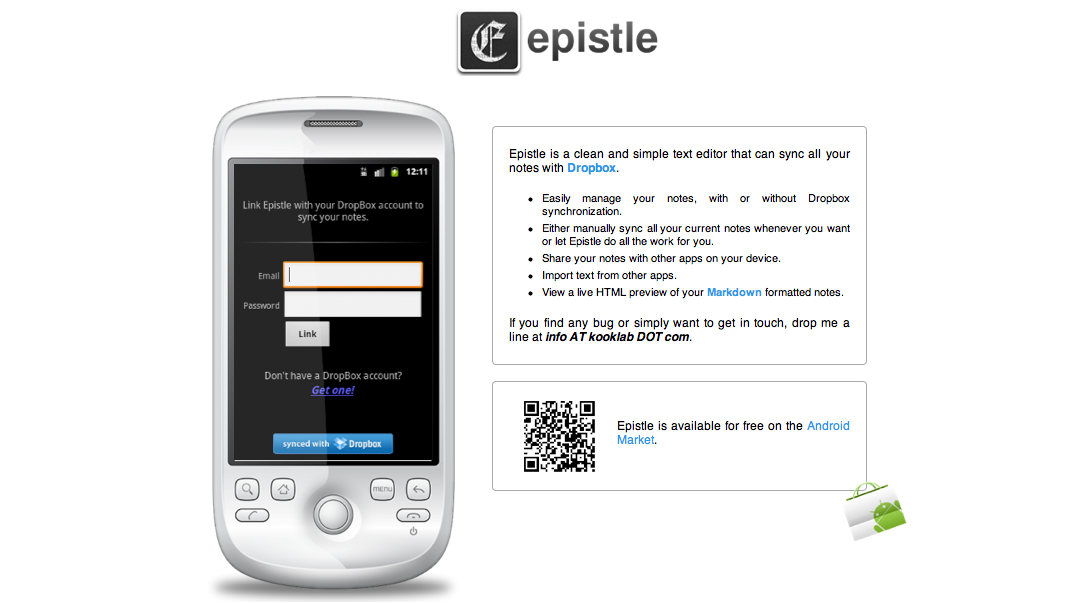
Epistle

Like nvALT, Epistle has built-in Markdown support. Which means I can write fully formatted blog posts on my phone, using the Markdown syntax. It has an elegant and minimal user interface. Note creation involves a single click and they can be organised alphabetically or by date. Also, you can select from serif, sans-serif and monospace fonts. After a couple of clicks, I had Epistle working in exactly the same way as nvALT. I was completely sold.

Getting in sync

However, there was a problem. Epsitle does not sync with Simplenote. Instead it syncs with Dropbox. Fortunately, I remembered reading a blog post demonstrating how to sync your notes in nvALT with Dropbox and Plain Text for iPad. Re-reading the post it was clear that I could do the same with nvALT, Dropbox and Epistle.

In short I switched to saving notes in nvALT as plain text files. Then I created a folder called ā€œNVā€ and moved all my notes to this folder. Next, I synced the folder with Dropbox using MacDropAny. To complete the setup, in Epistle, I changed the Dropbox folder it was syncing with to the ā€œNVā€ folder I had created. And that was it, my notes were synced across both devices.

Perfect and ā€˜Simpleā€™

Itā€™s almost a year since I first shared an insight into my note making and writing processes. In essence not much has changed. My setup and work flow remain perfect and ā€˜simpleā€™; revamped but much the same.
Redesigning jamesmichie.com(blog) – CSS FTW!

I’ve been tweaking and redesigning aspects of my blog ever since I started it, attempting to balance clean/minimal design while trying to provide visitors with an enjoyable reading experience and straightforward navigation. I feel that I’ve finally achieved this and in doing so learned a lot about CSS. Completing work on my blog resulted in me redesigning my homepage from scratch, creating a greater sense of uniformity between the two. As I’d done before, I called upon the excellent site: w3schools.com for help in figuring out padding, margins, borders and floats, amongst other attributes.

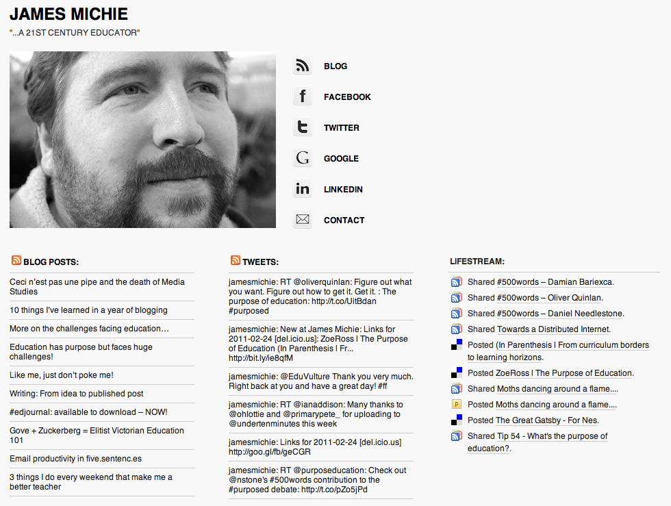
jamesmichie.com/blog

blog 26.02.11

My blog is built upon the ‘Plainscape‘ theme. It is a very simple, two-column theme with very few unique features which makes it highly adaptable. I have made some minor edits to the layout and have completely overhauled the header and footers to suit my needs. Ā This included moving my sidebar buttons and search box into the header. From my research this seems to be a more common place for them to be. While I was making these adjustments I also added a new photo to my about page, tidied up my categories and moved the Evernote, Delivr and Instapaper buttons to the top right of my posts, a position that I feel is moreĀ intuitiveĀ for their purpose. Also, I have made significant changes to the css of the blog creating a strict colour scheme. I’ve added borders around menus and the different sections of the sidebar to improve navigation. Overall, I am moreĀ satisfiedĀ than I have been for a while, feeling that the blog has a far more consistent/professional look.

jamesmichie.com

home 26.02.11

To bring my homepage up the same standard as my blog, I began by deleting Concret5 and installed WordPress instead. I then looked for a one column theme and settled on F8 Lite. Being fairly confident in editing html and css it didn’t take me long to match the css of my new homepage theme to that of my blogs. I then went about stripping many of the features from the header and footer sections. I made use of the themes widget placement being at the bottom to add my blog feed, tweets and lifestream. In the settings I changed the front page from ‘latest posts’ to a ‘static page’ and went about creating one, adding the same photo I had selected to use on my about page. I matched the buttons from my blog to direct people to the parts of my web footprint that I feel they would be most interested in visiting. And with that I was done. I now feel that my homepage does a much better job of representing me and gives a much clearer picture of the key parts of my web footprint.

Understanding and taking control of css was the biggest win during this process. It made a huge difference as it allowed me to make design changes with greater ease and far more consistency. I have included, below, the css attributes which are consistent accross both my blog and homepage.Ā If you would like to know about specific aspects or features, feel free to ask me in the comments.

CSS attributes:

background:

  • color: #f8f8f8

header, hmenu, sidebar header text:

  • font-family: ‘helvetica’, arial, sans-serif
  • font-weight: bold
  • text-transform:uppercase
  • color: #000000
  • a: #000000
  • hover: #34c48f

body, sidebar, footer text:

  • font-family: ‘helvetica’, arial, sans-serif
  • color: #333333
  • a: 34c48f
  • hover: #9a9a9a

meta text:

  • font-family: ‘helvetica’, arial, sans-serif
  • color: #9a9a9a

borders:

  • weight: 1px
  • style: solid
  • color: #9a9a9a