Responsive Part Two (Fine-Tuning)

After updating my blog and home page to be more responsive, I continued with a little fine-tuning. Here is a brief account of the additional changes I have made…

Blog

Blog Home 01.09.12

Typography

  • I have added a Google font called ‘Bitter‘;
  • I edited the sidebar CSS to make the font size and colour more consistent with the blog body.

Functionality

The majority of tweaks that I have made are focussed on improving the way the blog functions…

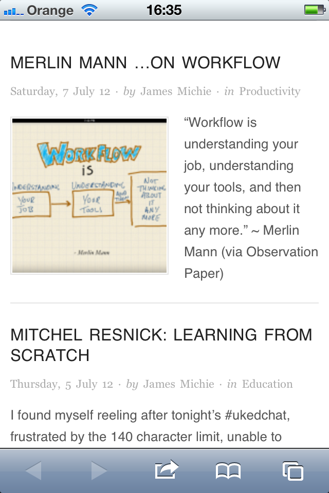
  • I have switched back to featuring whole posts on the front page of the blog rather than excerpts;
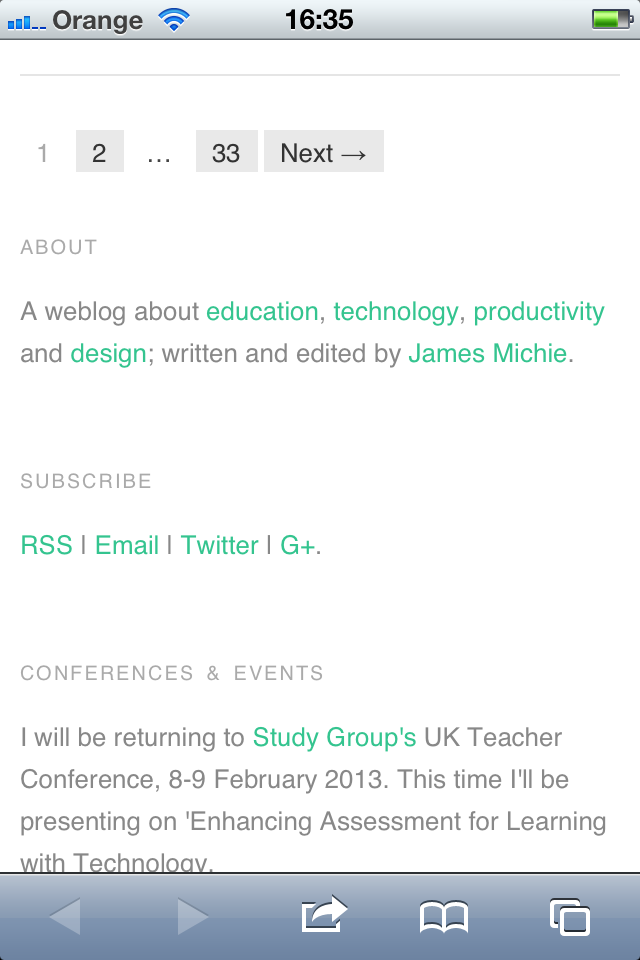
  • The about page has been updated to include an accurate list of my most popular posts;
  • To make it easier for visitors to find specific content, I have added category links at the top of the archive page;
  • All internal links now open in the same window; only external links open in a new window;
  • As well as videos and images, embedded Google Docs now resize automatically. I achieved this by editing the  FitVids.js script within my blog’s theme. While it doesn’t specify this on the FitVids.js github page, it will work with both ‘docs.google.com’ and ‘drive.google.com’ documents embedded using the iframe tag.

Home Page

Improved Home

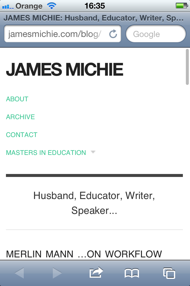
My home page now features a mini-profile with links to specific content, rather than a series of buttons. I think that it is more personal and does a better job of providing an overview of who I am, what I do, and where I can be found online.

I have also employed the built in menu to display direct links to key aspects of my online footprint, including my Twitter and Google+ profiles.

These changes have also improved the way the home page displays across all devices.

Responsive

The mobile web is in the ascendency, with many UI and UX designers, iterating for mobile before desktop. With this in mind I have been wrestling with CSS and HTML5 to make my blog more responsive to different screen sizes. However, I kept encountering a range of problems, trying to turn a basic WP theme into something far more up-to-date.

Instead I have installed the Origin theme, which is already set up to be responsive. Tinkering around with both the CSS and HTML, I have managed to construct a design that I am happy with. I coded a menu at the top and took the opportunity to install a new contact page. I also removed some features that I felt were peripheral, adding to the minimalistic style I favour.

Blog 15.07.12

Sporting the same theme as my blog, my home page is also more minimal, creating a more consistent experience for people who stumble across via search or through links on Twitter and Google+.

Home Page 15.07.12

I am most pleased with the way my blog now renders on mobile devices. The menu drops below the header, while the text resizes naturally to fit. The sidebar becomes pinned to the bottom of the page below the posts, and the posts themselves maintain all of their formatting. Images and videos also adapt to suit whichever screen they are being viewed on. Moreover, the blog is HTML5 compliant ensuring that all content is viewable regardless of OS or browser.

Blog iPhone 1

Blog iPhone 2

Blog iPhone 3

Blog iPhone 5

Please let me know what you think, particularly if you are viewing this on your mobile device. I’m interested to learn from others’ experiences; aiming to make my blog as accessible and user friendly as possible.