Responsive

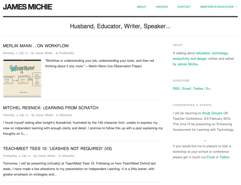
The mobile web is in the ascendency, with many UI and UX designers, iterating for mobile before desktop. With this in mind I have been wrestling with CSS and HTML5 to make my blog more responsive to different screen sizes. However, I kept encountering a range of problems, trying to turn a basic WP theme into something far more up-to-date.

Instead I have installed the Origin theme, which is already set up to be responsive. Tinkering around with both the CSS and HTML, I have managed to construct a design that I am happy with. I coded a menu at the top and took the opportunity to install a new contact page. I also removed some features that I felt were peripheral, adding to the minimalistic style I favour.

Blog 15.07.12

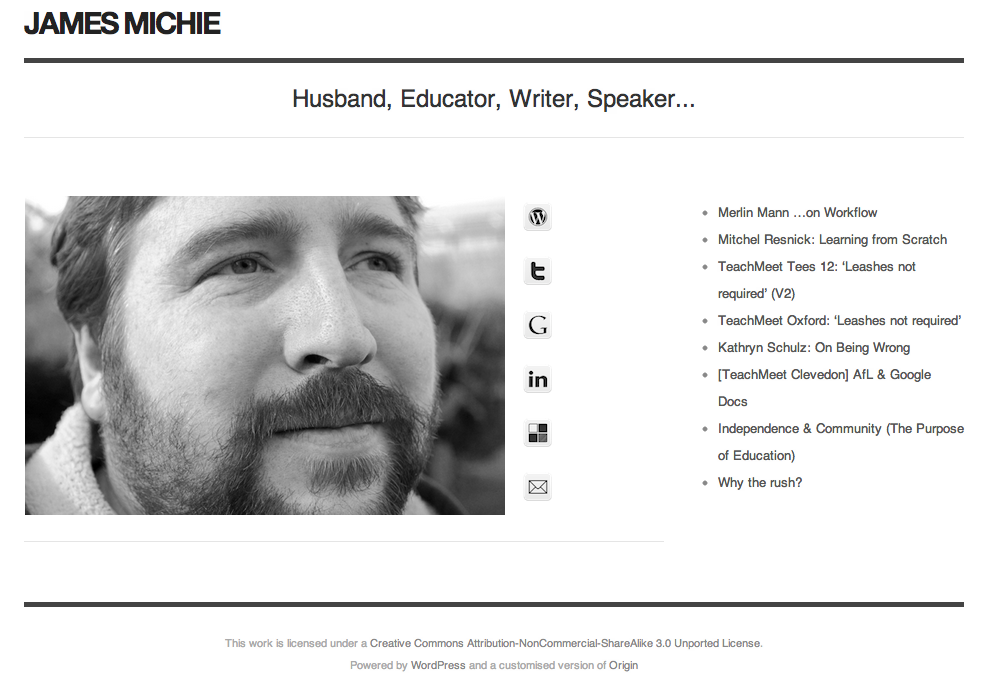
Sporting the same theme as my blog, my home page is also more minimal, creating a more consistent experience for people who stumble across via search or through links on Twitter and Google+.

Home Page 15.07.12

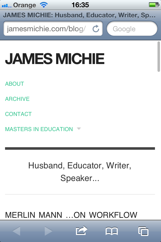
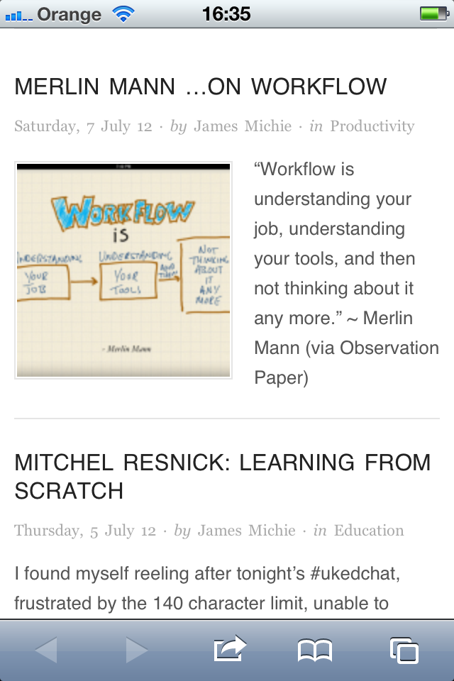
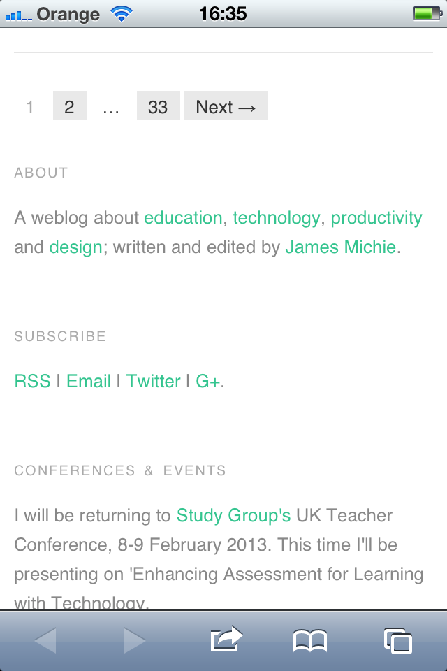
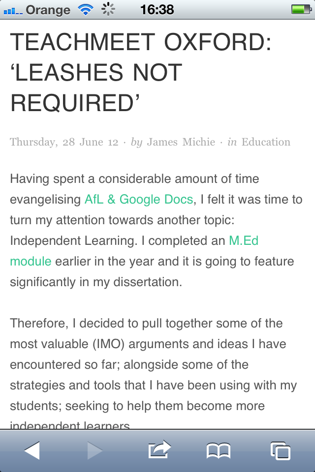
I am most pleased with the way my blog now renders on mobile devices. The menu drops below the header, while the text resizes naturally to fit. The sidebar becomes pinned to the bottom of the page below the posts, and the posts themselves maintain all of their formatting. Images and videos also adapt to suit whichever screen they are being viewed on. Moreover, the blog is HTML5 compliant ensuring that all content is viewable regardless of OS or browser.

Blog iPhone 1

Blog iPhone 2

Blog iPhone 3

Blog iPhone 5

Please let me know what you think, particularly if you are viewing this on your mobile device. I’m interested to learn from others’ experiences; aiming to make my blog as accessible and user friendly as possible.

Redesigning jamesmichie.com(blog) – CSS FTW!

I’ve been tweaking and redesigning aspects of my blog ever since I started it, attempting to balance clean/minimal design while trying to provide visitors with an enjoyable reading experience and straightforward navigation. I feel that I’ve finally achieved this and in doing so learned a lot about CSS. Completing work on my blog resulted in me redesigning my homepage from scratch, creating a greater sense of uniformity between the two. As I’d done before, I called upon the excellent site: w3schools.com for help in figuring out padding, margins, borders and floats, amongst other attributes.

jamesmichie.com/blog
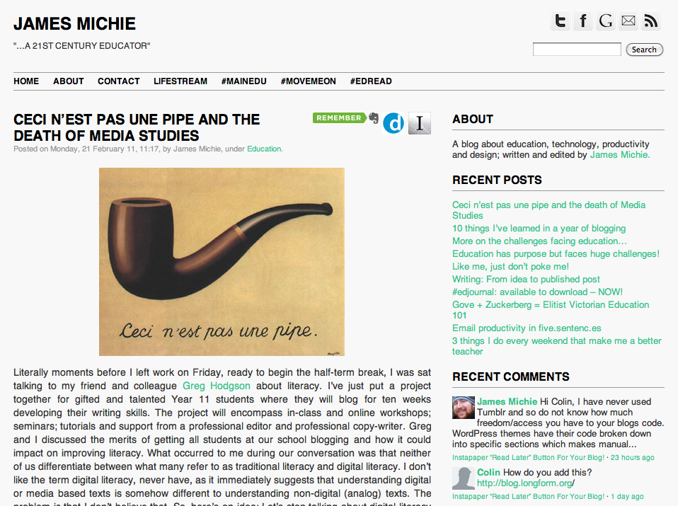
blog 26.02.11

My blog is built upon the ‘Plainscape‘ theme. It is a very simple, two-column theme with very few unique features which makes it highly adaptable. I have made some minor edits to the layout and have completely overhauled the header and footers to suit my needs.  This included moving my sidebar buttons and search box into the header. From my research this seems to be a more common place for them to be. While I was making these adjustments I also added a new photo to my about page, tidied up my categories and moved the Evernote, Delivr and Instapaper buttons to the top right of my posts, a position that I feel is more intuitive for their purpose. Also, I have made significant changes to the css of the blog creating a strict colour scheme. I’ve added borders around menus and the different sections of the sidebar to improve navigation. Overall, I am more satisfied than I have been for a while, feeling that the blog has a far more consistent/professional look.

jamesmichie.com
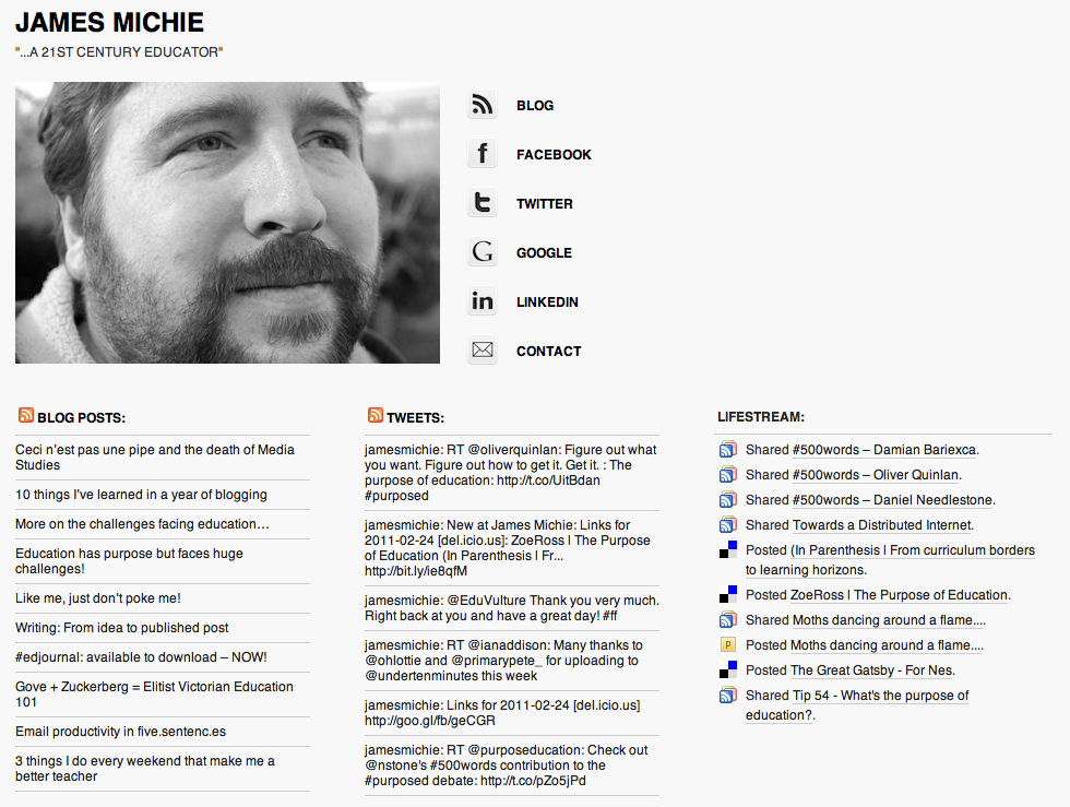
home 26.02.11

To bring my homepage up the same standard as my blog, I began by deleting Concret5 and installed WordPress instead. I then looked for a one column theme and settled on F8 Lite. Being fairly confident in editing html and css it didn’t take me long to match the css of my new homepage theme to that of my blogs. I then went about stripping many of the features from the header and footer sections. I made use of the themes widget placement being at the bottom to add my blog feed, tweets and lifestream. In the settings I changed the front page from ‘latest posts’ to a ‘static page’ and went about creating one, adding the same photo I had selected to use on my about page. I matched the buttons from my blog to direct people to the parts of my web footprint that I feel they would be most interested in visiting. And with that I was done. I now feel that my homepage does a much better job of representing me and gives a much clearer picture of the key parts of my web footprint.

Understanding and taking control of css was the biggest win during this process. It made a huge difference as it allowed me to make design changes with greater ease and far more consistency. I have included, below, the css attributes which are consistent accross both my blog and homepage. If you would like to know about specific aspects or features, feel free to ask me in the comments.

CSS attributes:

background:

  • color: #f8f8f8

header, hmenu, sidebar header text:

  • font-family: ‘helvetica’, arial, sans-serif
  • font-weight: bold
  • text-transform:uppercase
  • color: #000000
  • a: #000000
  • hover: #34c48f

body, sidebar, footer text:

  • font-family: ‘helvetica’, arial, sans-serif
  • color: #333333
  • a: 34c48f
  • hover: #9a9a9a

meta text:

  • font-family: ‘helvetica’, arial, sans-serif
  • color: #9a9a9a

borders:

  • weight: 1px
  • style: solid
  • color: #9a9a9a

I Have Moved!

I will keep this short and sweet. I have moved from jamesmichie.blogspot.com to jamesmichie.com/blog.

My blogging platform of choice is WordPress. I have a bit of minor tweaking left to do but the bulk of the work is done and I am pretty happy with the results.

I believe that I have migrated my Feedburner feed correctly so there should be no need for anyone to update. However, I will publicise the move as much as possible over the next couple of weeks just in case.

One thing that does not seem to have worked as well is Disqus. My comments are here in the Disqus WordPress Plugin page but they are not appearing below the relevant posts. It may simply take some time for the migration to take place, so I am not going to worry about it too much until tomorrow.

I would be very interested to know what people think about the redesign. Please comment below!

[UPDATE] I am slowly editing some of my older posts as the import from Blogger into WordPress has done some funny things with some of the paragraphing. I am also updating some of the links. I have also installed the Blogger to WordPress redirect plugin and now if anyone visits jamesmichie.blogspot.com or any individual post they will be redirected here to the matching post or page. I am waiting to hear from Disqus about sorting the permalinks of about 20 comments or so that are not displaying below the relevant posts. Overall, though, I am very happy with the way my new home is looking! 🙂

Moving!

This blog [jamesmichie.blogspot.com] will be moving to a new home very soon.

I spent several hours yesterday afternoon/evening tinkering with both WordPress and Posterous and have concluded that WordPress will be my platform of choice. I am going to use Posterous for a future #365 project and with my students due to its ease of use. As @stevegillott put it, Posterous is more of a “fire and forget thing”. Which is great for newbie bloggers but does not suit my needs.

I have already set up the WP blog and it is under construction. My new home is “jamesmichie.com/blog” and you can follow its progress over the next few days as I set it up. I have already transferred two of my static pages from this blog. I have added follow buttons, a CC license, search box, TweetMeme button and I have teaked the CSS chnging the font to Helvetica and the colour of hyperlinks.

When will the move be finished? It is my hope to have the move complete by the end of the weekend. My next full blog post will hopefully reach you from my new home. 🙂