Responsive Part Two (Fine-Tuning)

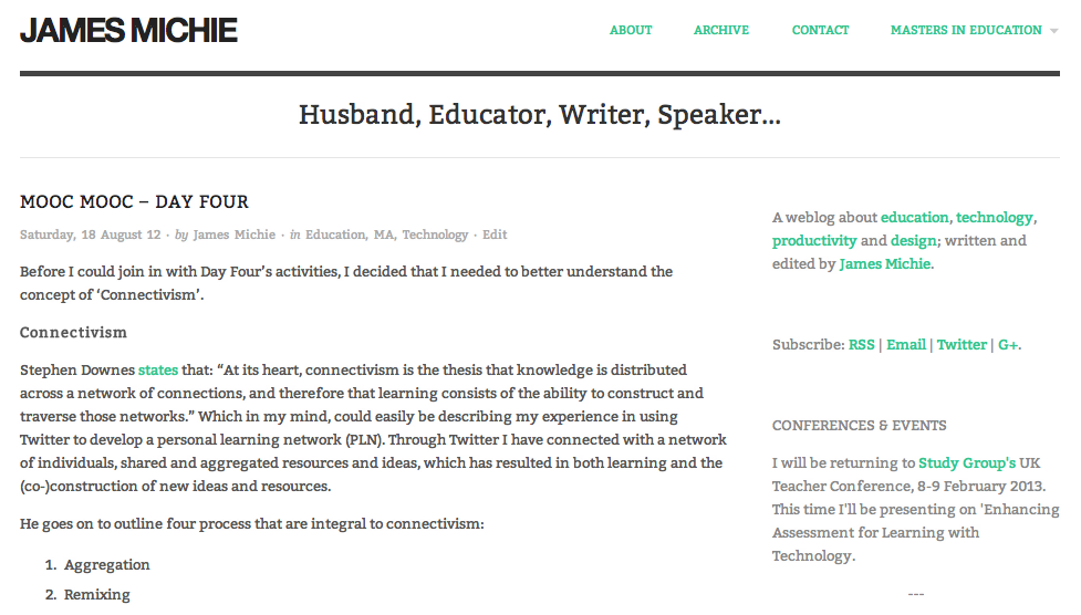
After updating my blog and home page to be more responsive, I continued with a little fine-tuning. Here is a brief account of the additional changes I have made…

Blog

Blog Home 01.09.12

Typography

  • I have added a Google font called ‘Bitter‘;
  • I edited the sidebar CSS to make the font size and colour more consistent with the blog body.

Functionality

The majority of tweaks that I have made are focussed on improving the way the blog functions…

  • I have switched back to featuring whole posts on the front page of the blog rather than excerpts;
  • The about page has been updated to include an accurate list of my most popular posts;
  • To make it easier for visitors to find specific content, I have added category links at the top of the archive page;
  • All internal links now open in the same window; only external links open in a new window;
  • As well as videos and images, embedded Google Docs now resize automatically. I achieved this by editing the  FitVids.js script within my blog’s theme. While it doesn’t specify this on the FitVids.js github page, it will work with both ‘docs.google.com’ and ‘drive.google.com’ documents embedded using the iframe tag.

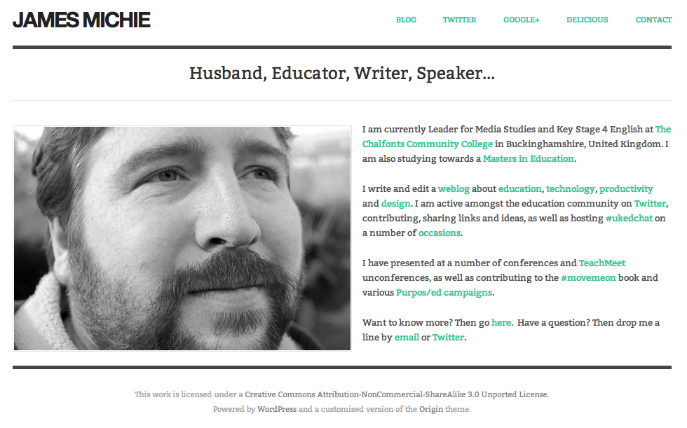
Home Page

Improved Home

My home page now features a mini-profile with links to specific content, rather than a series of buttons. I think that it is more personal and does a better job of providing an overview of who I am, what I do, and where I can be found online.

I have also employed the built in menu to display direct links to key aspects of my online footprint, including my Twitter and Google+ profiles.

These changes have also improved the way the home page displays across all devices.

Design as Teaching

golden flowers

I am in the middle of reading ‘Design: A Very Short Introduction’ by John Haskett. Like many other design related books ‘Design…’ begins by exploring the evolution of design establishing the idea that design permeates every facet of life. Haskett then goes on to discuss the merits and values of form and functionality – something which is explored effectively by Bruno Munari in the excellent ‘Design as Art’. Reflecting on the values of form and functionality got me thinking about how much design goes into the learning that takes place in my classroom and reminded me of something that I was told as a trainee during my first school placement.

Even the smallest change in environment will effect their (students) behaviour and attitude towards learning.

This has stuck with me and has had a profound effect on how I approach everything I do as a teacher. In all that I do, weather it is maintaining the learning environment or assessing students work, I give considerable consideration to both form and function.

The following is a list of ways that design (form and function) have impacted on the learning inside my classroom. In order to keep this meaningful I have not provided an exhaustive list but simply offered two examples for each area. Under each heading, the first example demonstrates how form has impacted on that particular area of my teaching. The second example demonstrates how functionality has had an impact.

Classroom (Learning Environment)

  • Your classroom must be clean with well maintained (preferably interactive) displays. It sends a message to the students, the minute they arrive in your room, about the sort of teacher you are and what standards you will expect from them.
  • The way that you use your seating in your classroom is exceptionally important. I have developed a seating plan system in which I seat my students in pairs based on similar ability. They are sat behind/in front of another pair who are slightly more able which allows me to minimise movement during group based activities. I also incorporate the students’ photos on to my plan along with their target grades and any SEN information that is available. For the first term I adjust the seating arrangements until I am happy that it works in terms of learning/behaviour. This process really helps me get to know them quickly and informs my understanding of each students potential.

Lesson Planning

  • I try to make sure that my lessons are engaging and challenging to ensure that my students enjoy what they are learning. This does not mean that my lessons are ‘fun’! It simply means that I ensure the activities are well designed for the different learning styles/abilities of the students in each of my classes. The right amount of challenge ensures that students feel engaged and will thus enjoy learning.
  • One of the keys to effective planning is maintaining an understanding of flow. I use Google Calendar to keep a record of my lessons. To ensure flow and that my classes and I reach our predefined goals I constantly review what we did in the previous lesson and what we will be doing in the following lessons. This helps me ensure that the activities and learning aims of each lesson are appropriate and will stretch/challenge each student to meet their goals by the end of the unit of work.

Teaching Style

  • I video myself regularly (I am not vain, honest.) to improve the quality of my lesson delivery. For example, I have made significant changes to the way I use the tone of my voice in lessons as well as simply kicking a few bad habits. However, I don’t think I will ever stop saying “erm…” all the time! ☹
  • I have also worked significantly on questioning techniques and approach certain lessons/units with a preconceived set of questions/questioning styles to facilitate different modes and levels of learning. It has also helped me be truly inclusive, having formed a specific methodology around questioning to target specific groups of students.

Homework

  • For both form and functionality I put nearly all of my homework online through the Moodle course that I am using for the particular unit I am teaching. I will often include a YouTube video as part of the homework, be it in a forum to spark discussion or as part of an assignment. Embedding the video is far more aesthetically pleasing that simply inserting a hyperlink. This video demonstrates how to embed YouTube videos into Moodle. The first method demonstrated works within the forum, wiki and assignment modules also.
  • One of the most important things about homework for you as a teacher is that it is manageable. This was one of the deciding factors in why I moved to putting nearly all of my homework online through Moodle. Marking online through Moodle is quick and relatively hassle free in both the forum and assignment modules. What’s more, Moodle gives you the ability to instantly grab data on students that have/have not done their homework. This record can be easily collated and printed to provide evidence for parents about their son/daughters completion (or lack there of) of homework. Very powerful!

Marking and Assessment

  • No red pens please! No, I’ve not bought into some educational fad. Red is simply an aggressive colour and I choose to avoid using it to mark my students’ work. Blue or green are equally good colours and show up perfectly well against the black type of my students’ essays. It’s simply a personal choice!
  • A recent redesign that has taken place within my teaching practice is that I have moved the majority of my formative assessment from paper and pen to electronic methods particularly through the use of Google Docs. I can assess a student work both in real time during a lesson and also after the fact. They can access their work and see my comments anytime they are online. And this method of assessment can, if used correctly, provide a clear record of the students targets and progression. (More on this in a future post.)

Technology

  • I love Apple. I teach on a MacBook Pro and adore the ergonomic and aesthetic beauty combined with seamless functionality that it offers. Apple produce devices that are objects of pure beauty. I used to be a PC but I could never return to “ctrl+alt+del”, erroneous file menus and (“spits”) Internet Explorer. Thinking about it makes me shudder! ☺
  • As a teacher I believe you should only use technology where it will enhance the learning of your students. I have put considerable time into testing and picking the technologies that I use with my students. They must be easy to use so that my students and I can focus on the learning rather than on how to use the technology. Here are three different examples of technology I have used with my students:

How has design impacted on your teaching? I would really like to know if some of the ideas I have put across have struck a chord or made you think about the form and functionality of your own teaching practice. You can comment below.

Image: ‘Golden Flowers’ by Shareen M on Flickr.

Blog Aesthetics & Improved Functionality

blank book

I had planned to blog about my use of Google Docs this past week. With it being half term, I certainly had the time to do so, but instead, I ended up using much of my time improving the design and functionality of my blog.

Here is a summary of the changes that I have made.

Design
One of the key things that I wished to change was the appearance of the blog, particularly the home page. I wanted it to be more minimal, have less information, with limited colour. Ultimately I wish to just show the 10 most recent blog post titles but for now I have set the blog to simply show the most recent post. I also changed the colour of the “visited links” as they were too light.

I created two new static pages. The first of which was a contact page including a self made form utilising the site:EmailMeForm. The other a dedicated page for the #movemeon book which I contributed to. This allowed me to remove a badge advertising the book from the blog’s sidebar as well as some text and hyperlinks.

To further improve the look of the blog across all of the pages I made further changes to the sidebar. I began by removing my Twitter stream and some unnecessary text.  I then considered changing the subscription and follow links from plain text to attractive “minimal” buttons.  Using my Twitter PLN I found some links to different button sets. After settling on a set which I found here, I created two mock ups and tweeted them out asking people to vote for either the set on the left or the right.
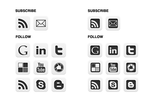
blog buttons choice

The set on the left received the most votes and that was my preference as well so I decided to go with it and went about adding the buttons to my blog (more about this process below). I also moved the buttons up to the top of the sidebar to increase their visibility. (I’m still mulling over the final row at the bottom which would include my Google Reader shared items, a link to call me on Skype and a link to my school Media Studies blog.

Finally, I edited my About page, updating sections with some of the projects I have been involved with this year.

Functionality
In making some of the aesthetic changes mentioned above I was also able to make some improvements to the functionality of my blog.

Changing the subscription and follow links from plain text to buttons meant that I had to learn more about HTML. (I already had some limited knowledge.) I learned how to add the buttons, hosting them in picasa and then linking to them. I wanted them to open in a new window/tab so I researched the code needed to make that happen and I also learned how to make text appear when the cursor hovers over them. I am very pleased with the finished functionality and hope that their placement at the top of the sidebar will help to increase my web presence.

Having learned how to make web links open in a new window/tab I set about editing all of my blog posts from May to do the same. Sticking with HTML I also added some code to my blog’s template to display related posts titles at the bottom of each post.  This should hopefully keep visitors on my blog for longer reducing my bounce rate. I then also removed the Sharethis widget (and related functionality) and replaced it with a TweetMeme retweet button. (See the bottom of this post.)

Finally, I made two significant changes to improve the subscription feed and data that I can get about my blog’s site traffic. I began by signing up with Google FeedBurner and syncing my old blog feed. I implemented a variety of additions (“FeedFlare”) to improve the promotion of my blog including syncing my Delicious bookmarks into my blog’s feed and making a wide variety of options for sharing my posts available to subscribers. I also set up subscription by email which I had seen on several blogs by people that I respected so felt it would be wise to offer my readers something similar. The final piece of code that I added to my blog was that of my Google Analytics account. It has already provided me with far more interesting information about my blog than the simple visit counter sitting at the bottom of my sidebar (which I may remove very soon).

So, no post about Google Docs but a lot of blog activity none the less. I am happy with the way the blog is looking and for now will give the tweaking a rest. I am not done though. Once the summer holidays begin I think that I will return to this process and do the following:

  • Add code to my blog so that only the blog post titles are displayed on the home page, archive page and label pages.
  • Display both the archive and labels in the sidebar as either a drop-down menu or expandable widget.
  • Add a blog roll of blogs I enjoy reading – also to be a drop-down menu or expandable widget.

I am always happy to know what people think so please comment below or tweet me @jamesmichie.

Image courtesy Štěpán Prokop on Flickr.