Designed in Sweden…

I was able to scratch two itches this past week: Start to learn how full-site editing works in WordPress and update my homepage in the process.

Screenshot of my updated homepage at jamesmichie.com.

Anders Norén released a new block theme called ‘Oaknut‘ earlier this month. It boasts a clean single page design, created specifically for landing pages. And with less than 150 lines of CSS, no javascript and locally hosted fonts, it is exceptionally privacy friendly and lightning quick.

I selected a monochrome style variation and got to grips with tweaking parts of the template, including individual blocks and group containers . I stuck with the suggested layout for the most part with a logo, title, tagline and four standard buttons directing visitors to four locations, three of which are on my main blog. All of this was relatively simple in the Gutenberg editor. Finally, I edited the footer and header. This was far easier now with no child theme required. All told, it took less than 30 minutes to go from installation to hitting publish.

I am really pleased with how it looks and even more pleased that it was designed in Sweden 🇸🇪 and is hosted in Germany 🇩🇪 – making my homepage a truly European 🇪🇺 affair.

Responsive Part Two (Fine-Tuning)

After updating my blog and home page to be more responsive, I continued with a little fine-tuning. Here is a brief account of the additional changes I have made…

Blog

Blog Home 01.09.12

Typography

  • I have added a Google font called ‘Bitter‘;
  • I edited the sidebar CSS to make the font size and colour more consistent with the blog body.

Functionality

The majority of tweaks that I have made are focussed on improving the way the blog functions…

  • I have switched back to featuring whole posts on the front page of the blog rather than excerpts;
  • The about page has been updated to include an accurate list of my most popular posts;
  • To make it easier for visitors to find specific content, I have added category links at the top of the archive page;
  • All internal links now open in the same window; only external links open in a new window;
  • As well as videos and images, embedded Google Docs now resize automatically. I achieved this by editing the  FitVids.js script within my blog’s theme. While it doesn’t specify this on the FitVids.js github page, it will work with both ‘docs.google.com’ and ‘drive.google.com’ documents embedded using the iframe tag.

Home Page

Improved Home

My home page now features a mini-profile with links to specific content, rather than a series of buttons. I think that it is more personal and does a better job of providing an overview of who I am, what I do, and where I can be found online.

I have also employed the built in menu to display direct links to key aspects of my online footprint, including my Twitter and Google+ profiles.

These changes have also improved the way the home page displays across all devices.

Responsive

The mobile web is in the ascendency, with many UI and UX designers, iterating for mobile before desktop. With this in mind I have been wrestling with CSS and HTML5 to make my blog more responsive to different screen sizes. However, I kept encountering a range of problems, trying to turn a basic WP theme into something far more up-to-date.

Instead I have installed the Origin theme, which is already set up to be responsive. Tinkering around with both the CSS and HTML, I have managed to construct a design that I am happy with. I coded a menu at the top and took the opportunity to install a new contact page. I also removed some features that I felt were peripheral, adding to the minimalistic style I favour.

Blog 15.07.12

Sporting the same theme as my blog, my home page is also more minimal, creating a more consistent experience for people who stumble across via search or through links on Twitter and Google+.

Home Page 15.07.12

I am most pleased with the way my blog now renders on mobile devices. The menu drops below the header, while the text resizes naturally to fit. The sidebar becomes pinned to the bottom of the page below the posts, and the posts themselves maintain all of their formatting. Images and videos also adapt to suit whichever screen they are being viewed on. Moreover, the blog is HTML5 compliant ensuring that all content is viewable regardless of OS or browser.

Blog iPhone 1

Blog iPhone 2

Blog iPhone 3

Blog iPhone 5

Please let me know what you think, particularly if you are viewing this on your mobile device. I’m interested to learn from others’ experiences; aiming to make my blog as accessible and user friendly as possible.

iPhone Apps (2)

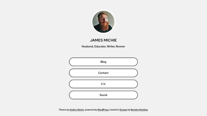
Since my previous post I have added a few more apps and settled on an arrangement for my home screen.

Alongside Tweetbot, Instapaper, Reeder, Kindle and Notesy which I added almost immediately, I have now added the following apps:

Evernote – I have been using Evernote to manage and organise my M.Ed studies. It is an invaluable tool. I use the desktop app almost every day and have been making regular use of the Android version. On first look, as I have found with other cross platform apps, both the iPhone’s UI and UX are vastly superior. What’s more the quality of the display on the 4S is crystal clear.

Instacast – Like Tweetbot, this is an app I have wanted to use for some time. It has been well reviewed, with the consensus being that there is no better app for the job. As an avid listener to podcasts, I am very pleased with my experience so far. What this app offers over the built in music app is the ability to stream shows, download on the fly and access show notes within the app itself. This makes for a far richer listening experience.

Agenda – The built in iPhone calendar has a very poor UI. Agenda, is clean and minimal, utilising sound principals of typographic design.

Pop – I’m a huge believer in ubiquitous capture and even with Notesy installed, sometimes all you need is a piece of paper. That is exactly what Pop offers: a piece of paper on to which you can write stuff down and return to later. The only other options are: select, select all, copy all and paste. This adds what I would call ‘useful friction’ in that when I decide to act on the information I have captured in Pop I will have to make an effort to move each piece around. This means I will be forced to decide if what I noted down is really valuable or not.

Taking photographs with a mobile phone is an activity I have never really been interested in. I think this is due to the poor quality of cameras I have encountered in previous phones. With the iPhone 4S’ 8MP camera, I am planning to take this as an opportunity to capture images on a more regular basis. I looked to my PLN on Twitter to help me get started and they didn’t disappoint. I chose to begin with the following two apps:

Camera+ – I decided to get this app as it offered some interesting improvements on the built in camera app: Improved zoom capabilities and a stabiliser (perfect for a novice photographer)

Snapseed – Nearly everyone who replied to my initial tweet recommended this app, and I have already had loads of fun playing with it. It offers a wide range of features, from basic editing features such as cropping and rotating to more stylistic effects such as manipulating depth of field.

iPhone Home Screen 12.04.12

In terms of arranging the apps, my choices are based on frequency and tactility. Apps towards the bottom of the home screen are the ones that I use most often. As such I want them positioned where I can access them quickly when holding the phone in one hand. Beyond that the apps are loosely grouped: Photography, Sound & Video, Reading, Notes/Writing, Interruptions.