Designed in Sweden…

I was able to scratch two itches this past week: Start to learn how full-site editing works in WordPress and update my homepage in the process.

Screenshot of my updated homepage at jamesmichie.com.

Anders Norén released a new block theme called ‘Oaknut‘ earlier this month. It boasts a clean single page design, created specifically for landing pages. And with less than 150 lines of CSS, no javascript and locally hosted fonts, it is exceptionally privacy friendly and lightning quick.

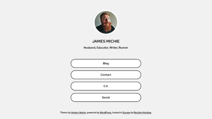
I selected a monochrome style variation and got to grips with tweaking parts of the template, including individual blocks and group containers . I stuck with the suggested layout for the most part with a logo, title, tagline and four standard buttons directing visitors to four locations, three of which are on my main blog. All of this was relatively simple in the Gutenberg editor. Finally, I edited the footer and header. This was far easier now with no child theme required. All told, it took less than 30 minutes to go from installation to hitting publish.

I am really pleased with how it looks and even more pleased that it was designed in Sweden 🇸🇪 and is hosted in Germany 🇩🇪 – making my homepage a truly European 🇪🇺 affair.

Responsive Part Two (Fine-Tuning)

After updating my blog and home page to be more responsive, I continued with a little fine-tuning. Here is a brief account of the additional changes I have made…

Blog

Blog Home 01.09.12

Typography

  • I have added a Google font called ‘Bitter‘;
  • I edited the sidebar CSS to make the font size and colour more consistent with the blog body.

Functionality

The majority of tweaks that I have made are focussed on improving the way the blog functions…

  • I have switched back to featuring whole posts on the front page of the blog rather than excerpts;
  • The about page has been updated to include an accurate list of my most popular posts;
  • To make it easier for visitors to find specific content, I have added category links at the top of the archive page;
  • All internal links now open in the same window; only external links open in a new window;
  • As well as videos and images, embedded Google Docs now resize automatically. I achieved this by editing the  FitVids.js script within my blog’s theme. While it doesn’t specify this on the FitVids.js github page, it will work with both ‘docs.google.com’ and ‘drive.google.com’ documents embedded using the iframe tag.

Home Page

Improved Home

My home page now features a mini-profile with links to specific content, rather than a series of buttons. I think that it is more personal and does a better job of providing an overview of who I am, what I do, and where I can be found online.

I have also employed the built in menu to display direct links to key aspects of my online footprint, including my Twitter and Google+ profiles.

These changes have also improved the way the home page displays across all devices.

Responsive

The mobile web is in the ascendency, with many UI and UX designers, iterating for mobile before desktop. With this in mind I have been wrestling with CSS and HTML5 to make my blog more responsive to different screen sizes. However, I kept encountering a range of problems, trying to turn a basic WP theme into something far more up-to-date.

Instead I have installed the Origin theme, which is already set up to be responsive. Tinkering around with both the CSS and HTML, I have managed to construct a design that I am happy with. I coded a menu at the top and took the opportunity to install a new contact page. I also removed some features that I felt were peripheral, adding to the minimalistic style I favour.

Blog 15.07.12

Sporting the same theme as my blog, my home page is also more minimal, creating a more consistent experience for people who stumble across via search or through links on Twitter and Google+.

Home Page 15.07.12

I am most pleased with the way my blog now renders on mobile devices. The menu drops below the header, while the text resizes naturally to fit. The sidebar becomes pinned to the bottom of the page below the posts, and the posts themselves maintain all of their formatting. Images and videos also adapt to suit whichever screen they are being viewed on. Moreover, the blog is HTML5 compliant ensuring that all content is viewable regardless of OS or browser.

Blog iPhone 1

Blog iPhone 2

Blog iPhone 3

Blog iPhone 5

Please let me know what you think, particularly if you are viewing this on your mobile device. I’m interested to learn from others’ experiences; aiming to make my blog as accessible and user friendly as possible.

[#ukedchat] Starting with a blank piece of paper: Design the school of your dreams.

uked11

Next Thursday, I will be hosting #ukedchat for the third time.

During my previous session, I asked:

Are schools (as physical spaces) necessary to facilitate learning in the 21st century?

The resulting discussion was a thoroughly engaging one, which raised more questions than provided answers. It was apparent that most of the educators who got involved, felt that schools as physical spaces still have purpose. However, it was also clear that schools in their current state are not 100% fit for purpose. Be it the learning space itself, the infrastructure or the curriculum, a number of areas for improvement were recognised.

In this next session, I want to pick up where the previous discussion left off and explore what a school should be like in the 21st century. In order to do that, I thought it would be useful to provide a premise:

Starting with a blank piece of paper: Design the school of your dreams.

In considering this, I wish for us to focus on the following areas:

Curriculum

What should be learned? How should it be learned? How should learning be structured? Subjects? Skills?

Assessment

Should learning be assessed? If so, how? Is there a place for grades? How can we accredit informal learning? AfL? Badges?

People

Who is to be involved? How will they be involved? Teachers? Students? Parents?

Space

Where will the learning happen? Classrooms? What role for libraries? What about virtual spaces?

Time

How long should the school day be? Should it be the same for everyone? How would lessons/timetable be structured?

Technology

What technologies should be utilised? Wifi? Tablets? BYOD?

To provide some further provocation, the following series of videos feature students from the Santa Barbara Middle School interviewing Sir Ken Robinson about his dream school; his answers are, as usual, well considered and challenging:

And so, if that has suitably whetted your appetite, I hope that you will be able to join me on Thursday at 8pm.

[Update: Saturday,  21 April] This was the 94th instalment of #ukedchat. You can read a summary of the discussion here and read/download a PDF archive of all the tweets here.